
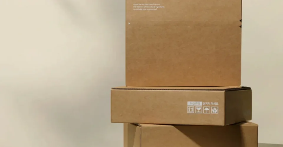
Sustainable packaging is always a priority for the sweets brands. So while switching to eco-friendly packaging boxes, doesn’t always mean giving up the right brand colors. There are some challenges amidst manufacturing natural kraft boards, like they have their own brown tone and an uncoated surface. However the same artwork will enhance the appearance on screen. Pantone notes that substrate, ink, and printing conditions can all affect the final appearance of color, particularly on uncoated stocks.
When we talk about specific industries like candy, chocolate, or confectionery, the real difference can be surprisingly important because of the intensity of market competition. Your signature might be a little dim and sometimes the adjustments and alignments of brightness appear much warmer than expected. The solution isn’t necessarily abandoning kraft. It’s choosing the right combination of material, color system, artwork, and proofing.
Why Does Kraft Board Change Printed Colors?
The Kraft board starts with a natural brown base rather than a clean white surface. When CMYK inks are printed directly on it, the substrate becomes part of the visual result.
The printed shades can change because of the lighter or highly saturated colors. CMYK printing always relies on complex combinations of different color palletes like cyan, magenta, yellow, and black. However the appearance of those combinations depends partly on the surface receiving the ink. Pantone specifically explains that CMYK results can vary with factors such as substrate absorbency and printing conditions.
There’s another detail worth remembering: white areas in artwork don’t automatically print as white in conventional CMYK printing. In many workflows, “white” simply means no ink, allowing the packaging material to show through.
That can be desirable for an earthy sweets packaging design. It can also be a problem when your brand depends on bright, clean colors.
Start With the Brand Colors That Matter Most
Not every part of your packaging artwork needs the same level of color control.
A practical approach is to divide your design into three groups:
| Artwork element | Color priority | Typical approach |
| Logo and signature brand color | High | Consider Pantone/spot color or white underprint |
| Product photos and complex graphics | High | CMYK, often over a controlled white base |
| Background textures and decorative elements | Flexible | Let the natural kraft tone influence the design |
This prevents over-engineering the entire package.
For example, a chocolate company may allow the kraft brown to become part of its visual identity while protecting its logo color with a more controlled printing treatment. That creates a natural appearance without letting the substrate dictate the entire palette.
CMYK or Pantone: Which Is Better for Kraft Boxes?
The answer lies in the process of printing and type of material used.
CMYK is well suited to photographs, gradients, illustrations, and artwork containing many colors. Pantone spot colours are useful when you need to reproduce a small set of specific brand colours more closely. Pantone describes spot color as a premixed ink applied directly, while process printing creates colors through combinations of standard inks.
But there’s an important catch: choosing a Pantone number alone doesn’t guarantee the exact appearance you expect on natural kraft.
Pantone distinguishes between coated and uncoated references because the stock itself changes how the color appears. Its Color Bridge and related guides are designed to help compare spot colors with their CMYK equivalents under particular print conditions.
So, for a sweets brand:
Usage of CMYK: when you are processing and your artwork contains photographs, gradients, illustrations, or many colors.
Consider Pantone when: the logo, signature color, or a limited number of brand colors must stay tightly controlled.
Use a proof on the actual stock when: the packaging color is business-critical.
When Should You Use White Ink on Kraft?
White ink is particularly useful when the natural brown surface is fighting against your desired colors.
A white underprint creates a lighter base beneath selected artwork before the other colors are applied. Printing specialists commonly use this approach on kraft and other colored substrates to reduce the influence of the underlying material.
Think of it as creating a controlled “white canvas” only where you need one.
For example, a candy brand could use:
White underprint + CMYK for a colorful product illustration.
White underprint + brand color for a logo.
No white underprint for background areas where the natural kraft appearance is part of the design.
That selective approach can preserve the eco-conscious aesthetic while giving important artwork more clarity.
You may not need white ink across the entire package. For a minimalist confectionery design using dark brown, black, deep green, or another naturally compatible color, direct printing onto kraft may actually look better.
Don’t Approve Packaging Color From a Screen Alone
One of the easiest mistakes in packaging design is approving artwork based only on what looks right on a monitor.
Screens use RGB light. Printed packaging uses inks interacting with a physical substrate. Even CMYK values aren’t absolute recipes for identical visual output across every press and material; Pantone notes that substrate and printing conditions can change the final result.
Before ordering your custom packaging boxes, ask for a proof or sample that represents the intended production route as closely as possible.
Check:
- Logo color
- Light and pastel shades
- Small text
- Fine lines
- Product photography
- Background colors
- Areas with white underprint
- Contrast between artwork and kraft
- Overall appearance beside the actual product
For a growing sweets brand, this step becomes even more important when several SKUs share the same packaging design.
Maintaining Color Consistency Across Multiple Sweets SKUs
Imagine a confectionery company selling strawberry, pistachio, chocolate, and vanilla products.
Instead of creating four completely different packaging systems, the brand could keep the same custom kraft boxes and use controlled accent colors to distinguish each flavor.
The critical part is defining the color system before production.
For every SKU, keep a record of:
Box material: the exact kraft or paperboard specification.
Color reference: CMYK build, Pantone reference, or approved production sample.
White-ink treatment: full, selective, or none.
Artwork version: the final approved file.
Proof: the version approved for production.
Finish: any coating or specialty treatment that can influence appearance.
This gives your packaging supplier a repeatable target rather than simply saying, “Make it look like the last order.”
That matters when your retail packages need to look like one family on the shelf.
Design the Kraft Color Into the Packaging Instead of Fighting It
The best eco-friendly packaging isn’t always the one that makes kraft look like white paper.
Sometimes the smarter strategy at Multiple Packages is to work with the substrate.
Deep browns, blacks, muted greens, earthy reds, and other colors can complement the natural surface. Minimal artwork can also make the visible paper texture feel intentional rather than unfinished.
For brands selling premium sweets, this can create a strong contrast: the package feels natural, while selective color, typography, or finishing gives it enough visual structure to remain distinctive.
The goal is controlled imperfection, not unlimited color freedom.
You want the kraft character to be visible where it supports the brand and controlled where brand recognition depends on accuracy.
A Practical Color-Consistency Checklist
Before approving your eco-friendly packaging boxes, ask five questions:
- What is the exact board or substrate?
- Which brand colors absolutely need to be controlled?
- Will those colors print directly on kraft or over white ink?
- Has the artwork been evaluated on the actual stock?
- Can the same color target be referenced for future reorders?
If the answer to those questions is clear, you’re much less likely to discover an unpleasant color surprise after production.
Can Eco-Friendly Packaging Still Look Colorful?
Absolutely. Sustainability and strong color printing aren’t mutually exclusive.
The important decision is understanding that eco-friendly packaging boxes made from natural kraft don’t behave exactly like bright white packaging stocks. Once that is accounted for during artwork preparation, color selection, proofing, and production, kraft can become part of the design rather than an obstacle.
For sweets brands, the strongest packaging systems usually balance three things: the natural character of the material, the clarity of the brand, and the practical requirements of retail presentation.
Multiple Packages offers packaging options for candy and sweets, including customized Candy Display Boxes with FSC-certified options and support for branding, color schemes, and packaging evaluation. Explore the Candy & Sweets packaging options and Retail Packaging to plan a box system that fits your products, artwork, and brand identity.