
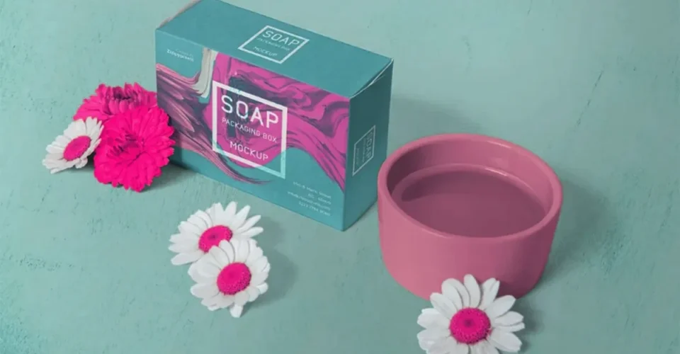
Packaging color does a lot of work for a soap brand. It is how a customer picks your bar out of a shelf of twenty, how the product page matches the box that turns up at the door, how a gift set reads as one set instead of four unrelated things.
The problem usually shows up on the second order. The first batch of custom soap boxes looks right. The reorder comes back a little darker, or warmer, or flatter than you remember. It is a small shift, but enough that two products from the same brand stop looking related.
Staying consistent takes more than keeping the design file. You need a color system you can specify, a clear idea of how the job will be printed, attention to the board it prints on, a proof you actually approved, and records you can hand back to your supplier a year later.
Here is how that works for soap brands buying soap boxes wholesale.
Why color consistency matters in wholesale soap packaging
Take a brand with six scents: lavender, eucalyptus, citrus, rose, charcoal, oatmeal. Same logo, same typography, same box across all six. Color is what tells them apart.
Now the lavender box from the second run comes back noticeably bluer than the first.
That box still looks fine on its own. The system is what breaks.
A consistent color system does two things. It helps customers read your products as one family, and it makes new SKUs cheaper to launch, because the framework already exists and you are only choosing a new accent color.
This matters more than people expect when handmade soap boxes, retail soap boxes, kraft soap boxes, or eco-friendly soap boxes wholesale get ordered at different stages of growth. Material, printing method and finish all affect how the color you picked actually lands.
Pantone points out that color appearance changes with the material and the production method, which is why a color spec has to account for real print and packaging conditions rather than what a screen shows.
CMYK vs. Pantone: which soap brands should I use?
The first real decision is whether your key brand colors get built out of CMYK process inks or specified as a Pantone spot color.
CMYK mixes cyan, magenta, yellow and black in different combinations to produce a wide range of printed colors. It handles full-color artwork, photographs, illustration and most packaging graphics.
Pantone works differently. You pick a color from a standardized system, so the designer and the production team are naming the same thing instead of describing it to each other.
That is not a guarantee. A Pantone number does not force every custom soap box to match perfectly. Substrate, finish, printing process and production conditions still move the result.
Pantone publishes Color Bridge references that show how spot colors compare with their closest CMYK process equivalents, which is useful when a brand color has to be reproduced in four-color process printing.
A practical rule of thumb:
| Branding requirement | Useful approach |
| Full-color artwork and photographs | CMYK process printing |
| Important signature brand color | Consider a Pantone reference |
| Brand color reproduced in CMYK | Review an appropriate Pantone-to-CMYK conversion |
| Multiple packaging materials | Check the color on the actual substrate |
| Repeat wholesale orders | Keep approved color specifications and proof references |
Which one you land on depends on the artwork, the production method, the material, the quantity, and how tightly the color needs to be controlled.
Do not approve colors from a screen alone
The digital file is essential. It is not a physical reference.
Your monitor makes color with light. A printed box makes color with ink sitting on a substrate. The two do not behave the same way, and calibration only narrows the gap.
So proofing matters. Before signing off on a large run of custom soap box through the production artwork, the color references, panel placement, bleeds and finishes. Teal Packaging, for example, builds artwork review and digital proof approval directly into its wholesale soap box workflow.
If your brand is color-sensitive, the point of proofing is to end up with an approved reference that the next production run can be measured against.
Do not tell your supplier to use the same purple as last time. Write down what the purple actually was.
Your Custom soap box material can change the final color
Same artwork, different board, different result.
This comes up when a brand moves between kraft soap boxes and white paperboard, or adds an eco-friendly substrate while keeping the identity unchanged.
Kraft has a brown base tone. White board does not. The same CMYK values sitting on those two surfaces will not look the same, and lighter or more transparent colors shift the most.
Pantone makes the same point: color appearance depends on material, so a packaging color system should be chosen with the intended substrate in mind.
Approving a color on one board tells you nothing about what it does on another.
Before you switch materials, check:
- the base color of the board
- whether the material is coated or uncoated
- the printing process
- any finishing or coating
- whether the artwork needs adjusting
- whether a new physical proof makes sense
For natural and sustainable brands using eco-friendly custom soap box, the packaging material is often part of the visual identity, which makes this check less optional than it sounds.
Build a color specification for every SKU
Documented systems are easier to reproduce. For a multi-product soap line, keep a packaging master sheet:
| Specification | Example |
| Brand logo | Approved master artwork |
| Primary brand color | Pantone reference and/or CMYK build |
| SKU color | Approved color reference |
| Substrate | Specified board or paper |
| Finish | Matte, gloss, etc. |
| Print process | Approved production method |
| Proof reference | Approved physical or digital reference |
| Revision | Artwork version and date |
That sheet earns its keep when the batch of custom soap box is being produced months apart, or when several SKUs are reordered at different times. Your supplier should not have to rebuild the color decision from memory.
Multiple scents and product variants
A soap packaging system should separate products without making every box look like it came from a different company.
One approach that scales:
- one logo treatment
- one typography system
- one primary brand color
- a different accent color for each scent
- the same structural box across the range
That gives you a visual family. It works well for brands selling handmade soaps, bath soap boxes, subscription products or retail collections where several boxes sit next to each other on a shelf.
The aim is variation you control. A lavender soap can look nothing like a charcoal soap and still read as the same brand.
Reordering soap boxes wholesale while maintaining consistency
Repeat orders are where the process gets tested.
Resending the original artwork and assuming nothing has moved is how inconsistencies get in. Before you reorder, confirm:
- the exact substrate is still being used
- the artwork file is the approved version
- brand and SKU colors are documented
- the previous proof or approved sample is on hand
- finishes and coatings are unchanged
- your supplier knows which elements need tight color control
If any of that has changed, whether it is the design, the material, the printing process or the finish, ask whether another proof should be reviewed before production starts.
For brands scaling from small runs into larger soap boxes wholesale orders, this habit prevents most of the color problems that show up across launches and reorders.
How Multiple Packages can help
Color consistency is a packaging workflow problem more than a graphic design problem.
Multiple Packages works across consultation, design, prototyping, production, logistics, material selection and cost-focused packaging planning. Its soap packaging solutions include custom printing, finishing, custom sizing, window cutouts and sustainable material options.
That range matters when a soap line is growing. Printing one good-looking box is easy. Keeping it practical and visually consistent as your products, quantities, materials and sales channels change is the harder part, and it is where the workflow shows.
What this means for your next order
Consistent packaging color comes from a defined reference, decisions about material and printing that you write down, and reorders that follow the spec you already approved.
For a soap brand, that means custom soap box printing sits inside brand management. It does not end when the artwork file goes to the printer.
When you are ready to develop or reorder custom soap boxes, Multiple Packages can build a packaging solution around your brand, products, materials and production requirements.