
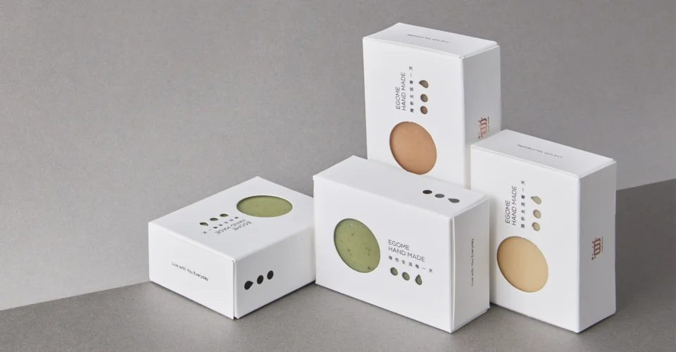
A custom soap box for a medicated line is doing two jobs at once. It has to help a shopper pick the right variant off the shelf, and it has to keep ingredients, directions and warnings readable once that box is in their hand. Color coding should help with the first job without trampling the second.
Anyone who has managed a multi-SKU range knows how this goes wrong. A brand launches with two soaps, adds three more, and by the fifth every box has its own color, its own layout and its own idea of where the logo sits. Colorful shelf. No longer one brand.
What holds up over time is a system that can absorb new variants.
One system across every variant
With medicated soap packaging, keep the structure fixed and change only what needs to change.
Logo in the same place on every box. Same typeface. Ingredient panels, warning areas and product names in the same positions with the same hierarchy. Color then becomes the thing that separates one SKU from the next, which is all it should be doing.
| Packaging element | Keep consistent | Change by variant |
| Brand logo | Yes | No |
| Typography style | Yes | No |
| Product-name position | Yes | No |
| Ingredient panel | Yes | No |
| Accent color | No | Yes |
| Variant identifier | No | Yes |
| SKU code | No | Yes |
This pays off later when a brand moves into custom soap boxes wholesale quantities. Managing twelve artworks built on one framework is a different job from managing twelve unrelated designs.
Color should point, not speak
Color coding works when it helps someone find what they’re looking for faster.
Different accents for acne-care, sensitive-skin, cleansing and moisturizing variants are fine. What color shouldn’t do is carry the meaning on its own. No shopper is going to remember that green is the sensitive-skin one. Put the variant name on the box in words, and let green do nothing more than make it easy to spot again.
This gets more important as the range grows. At eight or ten or twelve SKUs, a system that relies on color alone stops being navigation and starts being a memory test. Colors also run out of distinctiveness long before SKUs do, and pale blue next to pale teal on a shelf under supermarket lighting is not the difference you think it is.
Keep the small copy off busy backgrounds
This is where good-looking designs get into trouble.
An illustrated background can carry the front panel of a custom soap box beautifully. Run the same artwork across every side and the ingredient list becomes a chore.
For the copy that matters, quieter is better:
- dark text on a clean light background;
- light text on a solid color dark enough to hold it;
- minimal pattern behind ingredient panels;
- no critical copy sitting over gradients or detailed illustration;
- real space between separate blocks of information.
Gloss finishes are worth a thought too. A high-gloss laminate over a small ingredient panel throws back the store lighting, and a panel that reads perfectly on a matte proof can be hard work under a fluorescent strip.
Watch the creases as well. A fold running through the middle of a directions block will break the line, and the flat artwork never shows you that. Check the panel layout against the dieline, not just the visual.
Readability also looks completely different at full size. Something that reads fine on a 27-inch monitor can be uncomfortable on an 85mm panel, so review the artwork at 100% before it goes anywhere.
Give every piece of copy a priority
Not everything needs equal weight.
The front panel is doing retail work. Side and back panels carry the detail.
A workable product information hierarchy:
Front panel
Brand name → soap name → variant → primary product descriptor
Side and back panels
Directions → ingredients → applicable warnings → manufacturer information → barcode → batch or expiry where relevant
Exactly what’s required depends on the product, the market, the formulation and the claims being made.
That last point matters most when a soap is sold as “medicated.” In the United States, FDA explains that how a cleanser is regulated can change depending on what the product claims to do. A product marketed for cleansing alone may be treated differently from one presented as treating or preventing a condition.
The design consequence is real. If a product is regulated as an over-the-counter drug, its Drug Facts panel is not a layout you get to style. The headings, their order, the minimum type size (generally 6-point) and the contrast requirements are all specified. Find that out before the design is finished, because a Drug Facts panel dropped into artwork at the last minute is usually what pushes everything else into type sizes nobody can read. Have a regulatory reviewer confirm the requirements for your specific product and market.
So build the artwork around the information the product needs, and add the decoration afterwards.
Don’t judge type size on a screen
Small text that technically fits but is uncomfortable to read is the most common artwork problem there is.
Font size is only part of it. Readability also depends on the typeface, letter spacing, line spacing, background color, ink contrast, finish, panel width, and where the folds land.
The best check is the simplest one. Print the artwork at actual size, fold it if you can, and hold it the way a customer would. Read the directions and the ingredient list without zooming and without bringing it closer to your face than normal.
If your own team is squinting, it needs another pass. Customers won’t try as hard as you will.
The material changes the color
The same artwork does not look the same on every stock.
Pale blue on white SBS looks cleaner and brighter than the same pale blue on natural kraft. A recycled board brings its own base tone. Coatings and laminations shift how deep a color reads.
Contrast for small copy moves as well, which is the part that catches people out on custom product boxes across a skincare or soap range. Black 6-point type on the bright white board is crisp. The same type of kraft has noticeably less contrast behind it, and that can be the difference between a legible ingredient list and a grey smudge.
Digital proofs are good for layout and copy. For color and legibility, get a physical sample on the actual substrate with the actual finish.
One more production detail: keep the barcode on a light background with dark bars, leave the quiet zone clear, and avoid red or warm-toned bars. Red bars can read as blank to some scanners, and a barcode that fails at the till is an expensive thing to discover after a full run.
Plan for more SKUs than you have
A packaging system should be able to take next year’s products.
Before volumes get large, write down a few rules:
- which colors are reserved for which product types;
- which design elements never move;
- how variant names are written;
- where ingredients and warnings sit;
- how artwork versions are named;
- how the previous run gets checked before a reorder.
For smaller or growing brands, Low MOQ production is useful here, because it lets the team test the system before committing to volume.
A Low MOQ order also suits a new medicated variant where demand is still a guess. You get to look at shelf recognition, copy legibility and real printed color before scaling anything.
Once the range settles, moving from Low MOQ runs into custom soap boxes wholesale quantities is a much smaller step, because the artwork system has already been through real shelves and real customers.
Recognition and readability are the same problem
Shelf recognition matters. It’s just not the whole job.
Someone scanning a row of custom soap box should recognize the brand first and the variant second. Then, once the box is in their hand, everything should get easier to read rather than harder.
Color, typography and information hierarchy have to work as one system for that to happen. Brightening every SKU or adding more graphics doesn’t make a range clearer. Often the more confident move is to strip a panel back, open up the spacing, and let one accent color carry the difference.
For brands building out a medicated line, Multiple Packages’ medicated soap boxes and wider custom product packaging options are a starting point for structures, materials, printing and multi-SKU approaches.
FAQs
Should every medicated soap variant have a different packaging color?
Not really. One consistent design with different accent colors reads as a product family. Twelve different designs read as twelve different brands.
How can brands make small text easier to read on custom soap box?
Clear typography, enough spacing, strong contrast against the background, and nothing busy behind the important copy. Then check it at the actual print size.
Should color replace the soap variant name?
No. Color helps people spot a product again. The name still has to be on the box in words.
Does kraft paperboard affect printed colors?
Yes. Kraft has a brown base, so colors print darker or more muted than they do on white board, and small dark text has less contrast behind it.
How can brands keep packaging consistent across multiple SKUs?
Fix the rules for typography, logo placement, information panels, variant colors, artwork naming and reorder approval, and write them down somewhere the next designer will find them.
When should a soap brand order packaging in bulk?
Once demand and artwork have both settled. Before scaling, confirm the dimensions, the printed colors, the readability, the variant information and a physical sample, so growth doesn’t turn into rework.