
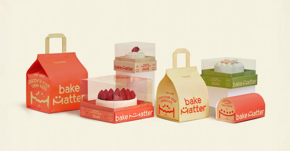
The same artwork prints differently on kraft and white custom bakery boxes because the board is part of what you end up seeing. Kraft is brown and uncoated, so it absorbs ink and tints everything printed on it. White paperboard starts neutral. Run identical CMYK files on both and the white box looks brighter and cleaner while the kraft box comes back warmer and a little muted.
That gap matters if your bakery, cookie brand, or confectionery business is recognized by its colors. Picking a board is usually treated as a structural or sustainability call. It is also a color decision, and you only find that out after the first run.
Why Does Kraft Change Printed Colors?
CMYK printing builds an image from cyan, magenta, yellow, and black. None of those inks are opaque enough to fully hide what sits underneath. On white board the base stays out of the way. On natural kraft the brown comes through and mixes into every printed area.
Light shades take the biggest hit. Pale pink, butter yellow, light blue, cream, and pastel green lose saturation on kraft and read dustier than the file. Dark colors hold up better, though the warm base still nudges them.
Surface matters as much as color. Kraft is usually uncoated, so ink sinks in instead of sitting on top, and that softens edges and drops density. Coverage, ink opacity, board shade, and surface texture all feed the final result.
When a designer says it looks perfect on screen, that is a statement about the monitor, not about the box.
Kraft vs. White Custom Bakery Boxes for Printing
If color accuracy is the priority, a white board such as SBS gives you a more predictable base. Kraft contributes its own tone on purpose, and that is the whole point of choosing it.
| Printing consideration | Kraft bakery boxes | White Custom bakery boxes |
| Substrate appearance | Natural brown tone | Neutral white surface |
| CMYK colors | Can appear warmer or more muted | Usually brighter and cleaner |
| Pastel colors | More affected by substrate | Easier to reproduce |
| White artwork | Requires a separate white-printing approach | Can use the white substrate itself |
| Natural aesthetic | Strong | More polished and neutral |
| Brand-color control | Requires careful planning | Generally easier |
| Printing approach | CMYK, selective white ink, or spot colors depending on artwork | CMYK or Pantone/spot colors |
Neither board wins outright. The decision comes down to what the packaging has to say and how close the printed color has to sit to your brand reference.
A rustic bakery often wants the warmth kraft adds, because a perfectly clean print would work against the look. A premium cookie brand running a tight pastel palette usually needs white stock to start from a clean base.
What Happens to CMYK Colors on Kraft?
A CMYK file is a set of numbers. The printed box is ink sitting on a physical surface, and the surface has a color of its own.
Take a bakery whose brand color is a pale blush pink. On a white box the paper behind it keeps it bright. On kraft the brown pulls it toward something earthier and less vivid, and the further the pink sits from full saturation, the more it moves.
Product photography behaves the same way. Bright highlights, white backgrounds, and delicate pastel detail have the least room to survive, because those are exactly the areas where the least ink is covering the board.
None of this rules out CMYK on kraft. It means the artwork has to be built for the board rather than adapted to it afterward.
For brands ordering cookie boxes wholesale, this compounds across reorders. A color that passed on the first sample can become a complaint later when the material, the press, or the artwork changes and nobody re-approved it against the board.
When Should You Use White Ink on Kraft?
White ink gives you a brighter base to print on when the design needs one.
The printer lays white under selected areas of the artwork, and the CMYK printed over it behaves closer to how it would on white board. Everywhere you leave white ink out, the kraft still shows through and still tints the ink, which is what makes it useful as a selective tool rather than a blanket fix.
White ink is not an accuracy guarantee. Opacity, registration, the board, and the printing process all affect how well it works, and it adds a step to production. Use it where the design needs it and leave it off where kraft is doing its job.
A rough way to decide:
Natural kraft look: let the board show through.
Brighter printed graphics: add a white underprint where those areas sit.
Critical brand color: talk to the printer about Pantone or another controlled spot-color approach.
CMYK vs. Pantone for Bakery Packaging
CMYK handles photographs, gradients, illustrations, and artwork carrying a lot of colors at once. Pantone and other spot systems give tighter control over one specific brand color.
A Pantone number is not a promise, though. The board still changes what you see. The same spot color printed on white board and printed straight onto brown kraft will not match, because the surface under the ink is not the same surface.
That is why brand-critical colors need to be judged on the material you are actually buying, not on a monitor and not on a proof pulled from a different stock.
Why Digital Proofs Can Be Misleading
A digital proof is good for checking artwork, layout, text, and image placement. It is a poor guide to color, because a monitor emits light and a printed box reflects it, and because the proof shows none of the board’s influence.
When color accuracy matters, ask for a physical proof or a printed sample on the intended board.
This comes up constantly with candy boxes packaging, where bright color, pastel tones, dark backgrounds, and product photography often carry most of the visual identity.
Before approving production, look at the artwork on the real board in normal lighting. A screen preview tells you whether the design works. A physical sample tells you whether the package works.
How to Keep Custom Bakery Box Colors Consistent
Consistency gets harder at the reorder, not the first run.
Keep the material spec, the artwork file, the print references, the finish, and the approved proof filed together with the original job. Switching from kraft to white board changes color, and so does switching to a different paperboard that looks close to the one you had.
A Low MOQ production run is useful when you are testing a new board or a redesign. Print a small quantity, see the color on the real material, check how it looks on the shelf and in a customer’s hands, then scale.
The rule worth writing down: approve color on the material you intend to sell, not on the screen you designed it on.
Which Material Should Your Bakery Choose?
Choose kraft when the brown, uncoated look is part of the brand and your artwork can live with a warmer cast.
Choose white paperboard when bright color, clean photography, pastel artwork, or tight brand matching matters more than the natural look.
Either way, settle CMYK builds, Pantone matching, white ink, proofing, and the expected result with your supplier before the run starts, not after the boxes arrive.
Multiple Packages produces custom bakery packaging across different structures and materials, including kraft and white paperboard, for cookies, cakes, pastries, macarons, desserts, and other baked goods.
Final Takeaway
Colors shift between kraft and white custom bakery boxes because neither board is visually neutral in the same way. Kraft’s color and uncoated surface change the ink sitting in it, while white paperboard gives CMYK and spot colors a brighter base to work from.
Which one suits you depends on the artwork and how much color control the brand needs. When a signature color has to stay recognizable across custom bakery boxes, cookie boxes wholesale, and candy boxes packaging, test it on the actual board, get a physical proof, and put the printing requirements in writing before production starts.