
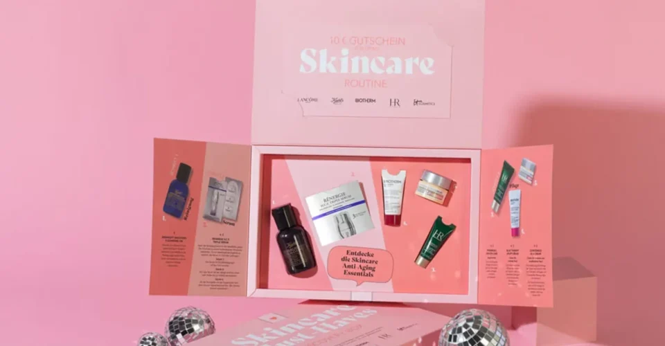
In the world of cosmetics and beauty brands, packaging is the first impression or look a customer can encounter of a custom beauty boxes aesthetics. Packaging is one of the most crucial elements. If the target audience tests a serum or maybe a twists up a lipstick, or smells a fragrance, they have already analyzed the branding message and brand image while reading the box packaging. They decide roughly what kind of brand this is and what it should cost.
That makes custom cosmetic packaging a selling tool as much as a container. Color does most of the early work, because it registers faster than a logo and much faster than an ingredient list. The trouble is that most color decisions get made on a screen, from a moodboard, months before anyone holds a printed sample.
What color psychology means in cosmetic packaging
Colors are really important in graphics as well as any packaging theme because they directly relate the palettes with the branding message. But when we talk about the psychological perspective, this is how color affects perception and buying behavior in the industry. In packaging, it mostly works as shorthand for category and price.
- Soft pastels read as gentle, skincare, wellness.
- Black reads as premium. Black also reads as cheap the moment the print quality slips.
- Greens showcase natural ingredients and sustainable environment.
- Gold and metallic shades always seem exclusive and premium.
- Bright, saturated color skews younger.
These associations are real but shallow. Psychology always showcases human behavior towards the specific color theme and shades and ultimately describes what a customer assumes in the first glimpse. The buyer’s decision eventually tells your category, your target audience, and your cost threshold while competitors already own on the shelf.
How color builds recognition before anyone reads the label
Colors have an amazing chemistry with people’s minds of the people and the recurring customers find beauty brands by their color theme and beauty block sometimes. It’s not always about scanning and reading a specific product description; rather, it’s about gaining the brand’s message and understanding the perspective. For example If someone sees the skincare box while analyzing deeply into the psychological context, the bottle label and the Instagram grid share a color system which is attractive. So anyone who saw you once in a store can easily find you online later without remembering your name.
If we talk about the dynamics of a premium brand of skincare, they usually use neutral tones and minimalist design with a clean composed alignment, restrained type and a finish that photographs well. A youth makeup brand can afford contrast and noise. The mismatch to avoid is a premium formula in a box that looks like it costs three dollars to produce, because customers treat the box as evidence of what is inside.
Four questions worth answering before any design work starts: who is buying, what should they feel, how does this look next to the competitor it will sit beside, and does the color support the price on the label.
Choosing colors by custom beauty boxes product category
Product category Common color direction What it is doing
Skincare White, beige, green, soft blue Reassurance. Nothing in here will irritate you
Luxury skincare Black, cream, metallics Setting the price expectation before the price is seen
Makeup Bold and contrasting Selling self-expression, competing for attention
Organic beauty Earth tones, muted greens Making an ingredient claim visually
Perfume Deep colors, metallic accents Carrying the whole emotional pitch alone
None of this is a rule. Breaking category convention is one of the cheapest ways to stand out, provided you know which convention you are breaking.
Color in custom perfume boxes
Fragrance is harder, because the product cannot be sampled online or through a sealed box. Custom perfume boxes have to promise a scent visually, which is why the category leans so hard on dark tones, foil accents, and very restrained layouts.
A boutique fragrance aimed at luxury buyers usually ends up in a rigid box: deep color, foil logo, almost no type. A summer release goes lighter. Either way, the box sets an expectation the fragrance then has to meet, which is a real risk and not just a design opportunity.
How printing and finishing change the color
The same ink looks different depending on what goes over it and what it sits on.
Matte
Matte lamination softens color and reads as expensive. It also scuffs. A dark matte box shows scratches and finger oils after a courier has handled it, which matters far more for shipping than for a shelf.
Gloss
Gloss lifts saturation and makes color look brighter and cleaner. It suits makeup and anything that needs to compete visually rather than whisper.
Foil stamping
Foil is metal, not ink, so it catches light in a way metallic ink never does. Keep it to logos and short words. Fine type and hairlines tend to fill in on the stamp.
Embossing and debossing
Raised or recessed detail gives the customer something to feel when they pick the box up. One element, usually the logo, is enough.
Spot UV
Spot UV puts gloss on selected areas. Over a matte laminate, it creates hard contrast without adding another color to the job.
What you can combine comes down to budget, run quantity, and how much handling the box gets between the printer and the customer.
A five-point check before you sign off on color
1. Positioning
Decide whether the product is affordable, premium, or luxury, and whether it should read as natural, clinical, or playful. A mass-market makeup brand and a luxury perfume brand should not be running the same process.
2. Audience
Mature skincare buyers generally respond to calm and conventional. A Gen Z line has more room to experiment, and usually needs to, because everything in that aisle is already loud.
3. Retail versus DTC
On a shelf, you need to be recognizable from three feet away, in bad lighting, next to four competitors. Ecommerce is a different problem. The box arrives alone and already paid for, so the work shifts to the unboxing and to whether the exterior survives transit. Brands ordering custom beauty boxes should look at the inside print as closely as the outside, since the interior is what gets photographed.
4. SKU expansion
Most brands design a box for one product and try to invent the system afterward. If sizes, seasonal editions, or gift sets are coming, decide now which element stays fixed across every SKU and which one is allowed to change.
5. Print accuracy
Color shifts between screen and press, between coated and uncoated stock, and between CMYK and a Pantone spot color. Kraft absorbs ink and dulls everything printed on it. Get a physical proof on your actual material before approving a run. A PDF proof tells you the layout is right and nothing else.
How custom beauty boxes support stronger positioning
Custom beauty boxes work when structure, material, print, and color get decided together instead of in sequence. A premium skincare line lives or dies on finish quality. A subscription brand is really buying the moment the lid comes off. A fragrance brand needs the box to carry a story the scent cannot tell until it is already sold.
Multiple Packages works with brands on customized packaging, covering materials, printing, finishes, and the production constraints that decide what can actually be made.
FAQ’s about cosmetic packaging color.
What colors work best for cosmetic packaging?
Colors are always selected on a specific criterion of brand theme, message and price. Luxury lines lean on black, cream, and metallic accents. Natural beauty brands tend toward earth tones and soft greens.
How does packaging color affect custom beauty boxes product sales?
Color is what gets a box picked up and what makes a brand findable again later. Whether it sells is down to the product and the price.
Should beauty brands use a different color for every product?
Usually not. A system works better: one element that never changes, with color separating the variants inside it.
Do finishes matter for cosmetic packaging?
Yes. Matte, gloss, foil, and embossing all change how the same color is read, and how expensive the box feels in the hand.
How early should packaging colors be decided?
Before production planning. Color drives material choice, printing method, and lead time, so a late change is the expensive kind of change.
Final thoughts
A color that looks perfect in a design file can arrive muddy on kraft, or scuffed after two days in a delivery van. The brands that get this right are not the ones with the best moodboard. They are the ones who printed a sample, put it on a shelf next to the competition, and looked at it before ordering ten thousand.