
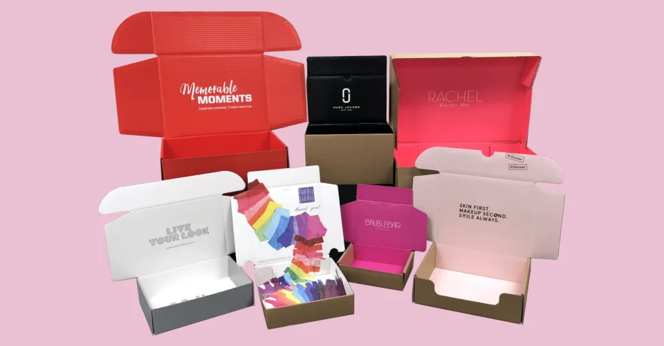
Your first batch of skincare cartons looked just right. The blush pink was warm, the logo stood out sharply, and the finish was just what the brand needed. Now you’re putting in a bigger order, and the way the print job’s going to be done has changed. Tell me one thing, can you approve the same artwork in the actual format and expect the same result? Well, that’s a factual analysis.
From digital to offset printing: The Necessary outcomes
Keep the original box around as a reference, but get clear on what the new print process needs to be able to replicate before sending off that wholesale custom boxes order, especially when larger quantities of cosmetic beauty boxes need to stay consistent with the original launch batch.
Why the Same Artwork Needs Another LookOver
Digital vs offset printing for your cosmetic packaging involves more than just the quantity. The actual print process, the inks, the surface of the paper, and the production conditions all come into play. Pantone says the same CMYK values just don’t reproduce the same way on every single press. What Colours Will You Be Working With?
Imagine that serum carton with a pale peach background and a dark green logo. The artwork is all the same, but the new offset print run is using a different board and ink set. You’ll need to check those colours against what you agreed on, particularly when the same artwork will be used across a larger batch of custom packaging boxes.
Reapprove These Four Key Elements
Element What to confirm Evidence to request
Brand colours | Intended target and achievable match | Agreed colour reference and suitable proof
Paperboard | Grade, shade, thickness, and surface | Exact stock specification and sample
Finish | Appearance and compatibility with the printed surface | Representative finished sample
Fine artwork | Text, thin lines, gradients, and separations | Preflight review and actualize printed checks
The key thing is whether each sample genuinely represents the feature you’re giving the thumbs up to, especially before wholesale custom boxes move into full production.
Set the Colour Target Before Even Comparing Proofs
Colour matching across print methods starts with a clear reference point. Should the offset print order match your original brand standard, the previous digital carton, or a brand new sample you’ve just approved?
Those targets may be different. Get that sorted out before production starts.
For Pantone vs CMYK colour matching, ask whether a Pantone colour will be using a special spot ink or just a process colour simulation. A Pantone reference in the artwork doesn’t, by itself, decide the production method. Pantone’s Colour Bridge shows how spot colours compare to their closest CMYK simulations, which can really help buyers get their head around the difference. Actually, what colour Bridge comparisons are we even talking about here?
Prioritize the colours your customers will actually notice: maybe it’s that green logo, a signature pink, or the background that’s shared across your whole range of cosmetic beauty boxes.
Confirm the Board and Get it Right Together
Make sure to record all the important details about the board grade, thickness, surface, and finish spec. And ask if the new order is going to use the same material as the launch run, or if the printer has picked a different one for offset production.
XRite has some decent guidelines on how they like their packaging material to be treated when it comes to color matching. Basically, they consider the substrate that you’re actually printing on to be part of the equation. They’ve got a workflow that includes coming up with ink formulas for the chosen material. Check it out at xrite.com.
When it comes to custom packaging boxes, reviewing paperboard and finish compatibility in tandem is a good idea. This becomes even more important with cosmetic beauty boxes, where subtle differences in board shade or surface finish can affect the overall appearance. Ask the printer for a finished sample when it matters, for example, if the appearance or handling of the box is crucial. And get them to explain any of the things that can’t be shown in the sample.
For a dark skincare carton, fold it up, pack it in a box and have a look at how the surface holds up to normal handling. For a pale minimalist design, place the finished sample right next to your reference copy. Make sure to check these things out before treating an unfinished print as a done deal on the finished box or approving custom packaging boxes for full production.
Check Fine Text at the Right Scale
If you’ve got fine text or artwork on your packaging and you probably do, especially on serum cartons and cosmetic minis, you need to review it carefully.
Ask prepress to check these things out:
- How the small black text is looking, and also what the ink separations are.
- White lettering that’s been reversed out of coloured backgrounds.
- Thin lines, gradients and fine logo details.
- What the overprint settings and separate finishing layers are.
Adobe says that overprinting black on top of coloured backgrounds can help prevent misregistration, but actually, the right setup depends on the artwork, so get the printer to confirm it rather than just winging it. And don’t rely on zooming in on a PDF to read the printed copy at the actual size, or you might miss how tricky a small product name or instruction can be on the finished carton.
Know What Your Proof Is Actually Good For
Cosmetic packaging proof approval works best when you’ve got a clear idea what the proof is meant to check.
A screen PDF is good for checking the wording, layout and artwork version. A properly prepared colormanaged proof is good for checking if the color is going to turn out right, though this does depend on the proofing setup. Adobe say it’s all about the monitor, profiles and viewing environment. Photoshop
For a Low MOQ trial, try to be clear on which approvals need to be repeated later on so the team knows what to expect.
Get Your Approval Right Before Booking Production
When you’re getting ready to go into production on wholesale custom boxes, make sure the approval process leaves a clear record of all the important stuff, including:
- The final artwork filename and version.
- The confirmed stock, print process and finish.
- The approved colour reference and agreed variation.
- Any limitations on the sample you’ve been checking and what still needs to be checked.
- The approval owner and production release date.
Make sure to include the proofing process and any revisions that come up in the launch schedule. Confirm who’s responsible for stopping production if the agreed target can’t be met.
Keep the approved samples on hand for checking the stock when it arrives and for any future wholesale custom boxes reorders.
When it comes to placing your next order, share the original carton, artwork and proposed quantity with the Multiple Packages beauty packaging team. Let them know you’re moving from a Low MOQ launch to a bigger run, and ask them which specs and samples need rechecking before production can start.