
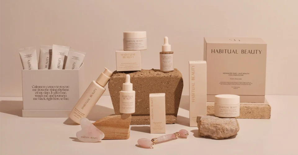
Going from three products to twelve changes what packaging is. A single design becomes a system that has to survive reorders, new variants, and print runs months apart.
Your cosmetic box packaging now has two jobs at once: making every box unmistakably yours, and making each shade, formula or scent easy to tell apart on a shelf. When the system works, the range reads as a family. When it does not, you get mismatched whites, brand colors drifting between runs, and customers picking up the wrong SKU.
Start with a color system
Most multi-SKU drift traces back to treating color casually. Across twelve boxes printed at different times, on different substrates, in different quantities, “close enough” accumulates until it is visibly off.
Two terms do most of the work. CMYK is standard four-color printing: flexible, cost-effective, good with photography and gradients, and liable to shift slightly from run to run. Pantone uses pre-mixed spot inks matched to a fixed reference, which is what you want anchoring a brand color that has to be identical on every reorder.
Most skincare lines are best served by a hybrid. Lock the core brand color, logo and key background as a Pantone spot so they never move. Run CMYK for the variant artwork, imagery and shade cues that change per SKU. The identity holds while each product still gets room to differentiate itself.
The gap between proof and print
The proof you approve and the final cosmetic box packaging will never match perfectly. That is normal, and knowing it in advance is the difference between a manageable variance and an argument with your supplier.
The industry measures that difference as Delta E, a numeric value for how far apart two colors sit. A Delta E under about 1 is effectively invisible to most people, and commercial printing commonly works to a tolerance somewhere around 2 to 3 for brand colors, depending on the process and the substrate. Agree a tolerance with your printer at the start rather than discovering after delivery that you each had a different standard in mind.
Beyond that, reduce the gap with disciplined proofing. Request a physical proof on your actual board before a full run, for the first order and for every SKU added later. A PDF confirms layout and tells you nothing reliable about color. A printed sample on your real substrate tells you what you are buying.
This is where prototype and sampling support earns its cost. At Multiple Packages, 3D visualization and physical prototyping let you hold a variant before committing to production, so the surprises happen on a sample instead of on 5,000 boxes.
Pick one substrate and stay on it
The board changes everything about how color reads.
SBS paperboard is smooth and bright white, so colors print crisp and clean. It is the usual choice for premium makeup packaging box and cosmetic box packaging ranges and anything that needs to look luminous. Kraft board is natural brown and warm, which suits sustainability-led brands, though that brown base shifts every color printed over it: a bright teal on SBS becomes a muddier teal on kraft. Rigid board is the thick format used for gift sets and hero products, and it carries a weight in the hand that folding cartons cannot.
For consistency, choose one primary substrate for the core line and hold it across variants. If SKU 4 is on SBS and SKU 9 is on kraft, your matching brand color will read as two different colors the moment they sit side by side. Keep contrasting substrates for tiers meant to feel different, such as a rigid gift set.
Board varies between mill batches too, particularly where recycled content is involved. Recording the exact specification rather than “white folding carton” is part of what makes a reorder match.
Design a hierarchy
Customers and retail staff should be able to scan the shelf and understand the range without reading it.
Build it in two layers. Constant elements stay identical on every box: logo, brand color, typography, layout structure. Variant elements change in a controlled way: a shade block, a color-coded stripe, an icon, the product name.
Strong ranges change one thing to signal a variant. Twelve serums sharing a color-block system look deliberate. Twelve different layouts look like an accident on a shelf.
Match finishes to function
Finish inconsistency creates the same drift as color, so settle the finish language once and apply it across the line.
Soft-touch lamination reads velvety and premium. Matte is understated. Gloss is punchy and survives transit better. Spot UV adds shine to selected areas like a logo. Foil and emboss carry genuine luxury cues.
Keep the base finish uniform across the core range and reserve premium treatments for tiers you want to feel elevated. Finish also moves color, since a matte laminate slightly darkens what sits under it. A matte SKU and a gloss SKU printed from identical files will not look identical.
Direct print, sleeves, or labels?
Not every SKU needs fully cosmetic box packaging, and this decision usually sets your unit economics at low volume.
| Approach | Best for | Consistency | Cost at low volume | Reorder flexibility |
| Direct printing on the folding carton | Established core SKUs, larger runs | Highest, fully unified | Higher setup per SKU | Best for stable ranges |
| Printed sleeves over a neutral base box | Frequent variant swaps, seasonal drops | High when the base box is fixed | Lower per new variant | Excellent across many SKUs |
| Labels or stickers on a blank box | Sampler sizes, tests, early launches | Moderate, can read less premium | Lowest | Fastest to change |
A setup that works for a lot of growing brands: direct-print the hero folding carton, then use sleeves for line extensions and seasonal shades. One dependable base box, new variants added affordably, and low MOQ flexibility preserved while the range expands.
That flexibility matters most when a shade might not survive its first season. Committing to a full print run for an untested variant is how brands end up storing cartons for a discontinued product.
Print your SKUs together where you can
However, nail polish boxes printed in the same run, on the same press, from the same board batch, with the same ink, match each other far more closely than boxes printed six weeks apart. Ordering the full range in one production run removes a whole category of variance, when cash flow and storage allow it.
Where that is not practical, a low MOQ order per variant plus a retained physical sample from the first run gives your printer something physical to hit on everything that follows.
Structure and reordering
Standardize inserts, dividers and makeup packaging box dimensions wherever the formulas allow, so a serum and a moisturizer share a footprint. That pays off across retail merchandising, ecommerce shipping and gift set assembly at the same time.
Then document it: every approved Pantone, the substrate specification, the finish, the dieline, the agreed tolerance, and a retained physical sample, all in one reference. Six months later, when you reorder or add SKU 13, the supplier prints to a locked standard instead of interpreting what you meant.
FAQ
Can I print my brand color on both kraft and SBS and still match?
Not reliably. The brown base shifts with every color printed on it, so a matching multi-SKU look needs one substrate across the core line.
When should I use Pantone instead of CMYK?
Pantone for the brand color that has to be identical on every reorder. CMYK for imagery and variant artwork that changes per SKU.
Do I need a new box for every shade?
No. A neutral base box with printed sleeves covers many variants at lower cost, which suits fast-expanding lines, nail polish boxes and lipstick ranges carrying dozens of shades.
Is a low MOQ order worth it for a new variant?
Usually. A low MOQ run lets you test a shade in market first, and the higher unit price costs less than warehousing boxes for a variant that gets pulled.
Build a system that scales
Cosmetic box packaging and makeup packaging boxes should scale as predictably as the formulas do. Whether you are launching a first custom printed collection or taking a private label range past a dozen variants, the aim is one system that holds its standard order after order.
Multiple Packages offers 3D visualisation, prototyping and sampling, packaging design and engineering, and multi-packaging orders for brands managing a range across many SKUs, including low MOQ production for new and seasonal variants.